Technical editor for creating responsive web forms
The legacy form editor couldn’t handle responsive web design, putting the company at risk of falling behind.
Over the course of a few months, I designed a new in-browser technical editor with live previews, enabling consultants to rapidly deliver mobile-ready forms and stay competitive.
Sole inhouse UX/Frontend Designer on small dev team (2018-2025)
Timeline
2014
The Challenge
The settings page from the legacy Capevo XForm editor. The editor itself was a canvas where form elements were placed with fixed positions and dimensions. This made it impossible to create responsive forms that adapted to different screen sizes.
Thus, it was imperative to design and build a new editor that could handle responsive design.
The Process
One of the very first Balsamiq sketches with multiple full-height panels.
Further explorations of a design split into panes.
A rough HTML prototype of a three pane design.
The Solution
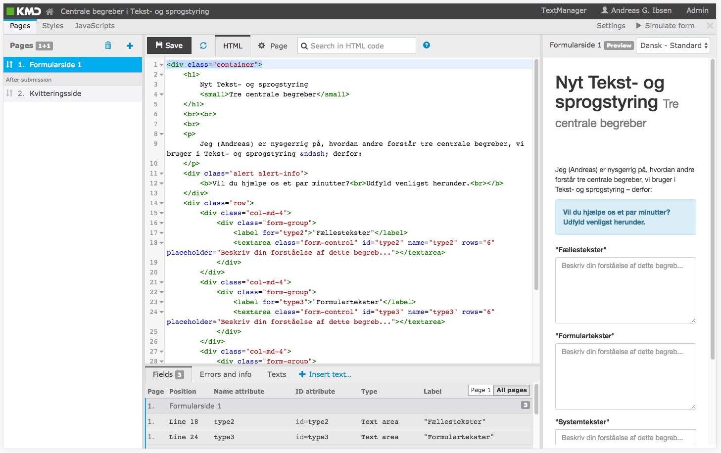
The final KMD XForm Responsive Editor design with the ability to edit source code HTML, CSS and JavaScript while live previewing the resulting form on the right.
Open to work I'm open to new UX jobs and projects — remote or near Aarhus, DK.